Accordion Component
Usage
The Accordion component allows for the creation of a collection of components, composed as panels, and arranged in an accordion on a page, similar to the Tabs Component , but allows for expanding and collapsing of the panels.
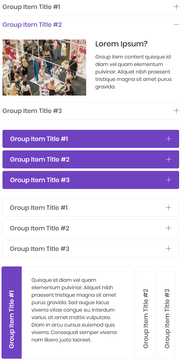
Example
From top to bottom: Default, Primary, Secondary, and Horizontal.
Authoring
Configure Dialog
The configure dialog allows the content author to define the accordion and how it will behave and appear for a visitor to the page.

Items Tab
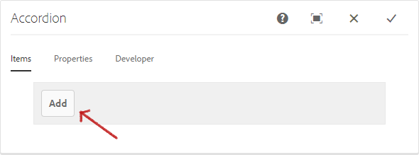
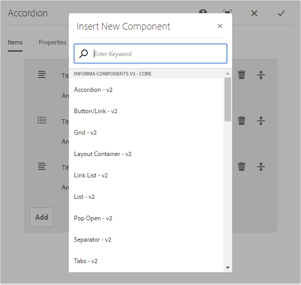
Use the Add button to open the component selector to choose which component to add as a panel.
Once added, an entry is added to the list, which contains the following columns:
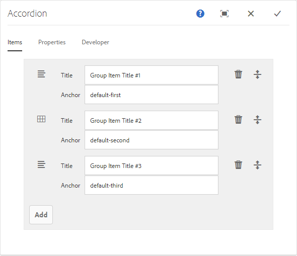
| Column | Description |
|---|---|
| Icon | The icon of the component type of the panel for easy identification in the list. Mouse over to see the full component name as a tooltip. |
| Description | The description used as the text of the panel, defaulting to the name of the component selected for the panel. |
| Delete | Tap or click to delete the panel from the accordion component. |
| Rearrange | Tap or click and drag to rearrange the order of the panels. |
Properties Tab
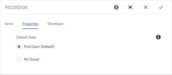
The properties tab allows you to select the default state of the accordion when viewed by the visitors.
| State | Description |
|---|---|
| First Open (Default) | The first panel is expanded when the page is loaded. |
| All Closed | All the panels are collapsed when the page is loaded. |
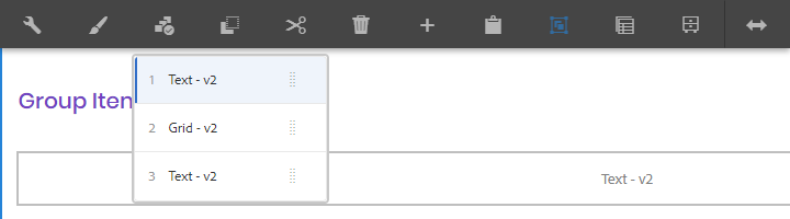
Select Panel Popover
The content author can use the Select Panel option on the component toolbar to change to a different panel for editing as well as to easily rearrange the order of the panels within the accordion. Use this to edit collapsed panels.

Once selecting the Select Panel option in the component toolbar, the configured accordion panels are displayed as a drop-down.
Note
- The list is ordered by the assigned arrangement of the panels and is reflected in the numbering.
- The panels are displayed by component type.
- Tapping or clicking an entry in the dropdown, switches the view in the editor to that panel.
- The panels can be rearranged in-place by using the drag handles.
Styles
The accordion comes with a number of available styles that will be customized for your specific site and theme. You can use the styles selector to pick a style for your accordion.

Available Styles
- Primary
- Secondary
- Horizontal
Developers
Markup
<div class="cmp-accordion" data-cmp-is="accordion">
    <div class="cmp-accordion__content" id="some_unique_ID}">
        <div role="tabpanel" id="some_unique_ID" class="card cmp-accordion__item cmp-accordion__item cmp-accordion__item--active" data-cmp-hook-accordion="item">
            <div class="card-header cmp-accordion__heading" id="some_unique_ID">
                <a href="#default-first" class="cmp-accordion__heading-link ">
                    <h4 class="cmp-accordion__heading-title " data-target="#some_unique_ID" aria-expanded="true" aria-controls="some_unique_ID" data-toggle="collapse">Group Item Title #1</h4>
                </a>
            </div>
             <div id="some_unique_ID" aria-labelledby="some_unique_ID" data-parent="#some_unique_ID" class="collapse cmp-accordion__item-child cmp-accordion__item-child show cmp-accordion__item-child--active">
                <div class="cmp-accordion__item-content card-body" id="default-first">
                    <div class="text component">
                        <div class="cmp-text">
                            <p>...</p>
                        </div>
                    </div>
                </div>
            </div>
        </div>
        <div role="tabpanel" id="some_unique_ID" class="card cmp-accordion__item cmp-accordion__item" data-cmp-hook-accordion="item">
            <div class="card-header cmp-accordion__heading" id="some_unique_ID">
                <a href="#default-second" class="cmp-accordion__heading-link ">
                    <h4 class="cmp-accordion__heading-title  collapsed" data-target="#some_unique_ID" aria-expanded="false" aria-controls="some_unique_ID" data-toggle="collapse">Group Item Title #2</h4>
                </a>
            </div>
            <div id="some_unique_ID" aria-labelledby="some_unique_ID" data-parent="#some_unique_ID" class="collapse cmp-accordion__item-child cmp-accordion__item-child">
                <div class="cmp-accordion__item-content card-body" id="default-second">
                    <div class="text component">
                        <div class="cmp-text">
                            <p>...</p>
                        </div>
                    </div>
                </div>
            </div>
        </div>
        <div role="tabpanel" id="some_unique_ID" class="card cmp-accordion__item cmp-accordion__item" data-cmp-hook-accordion="item">
            <div class="card-header cmp-accordion__heading" id="some_unique_ID">
                <a href="#default-third" class="cmp-accordion__heading-link ">
                    <h4 class="cmp-accordion__heading-title  collapsed" data-target="#some_unique_ID" aria-expanded="false" aria-controls="some_unique_ID" data-toggle="collapse">Group Item Title #3</h4>
                </a>
            </div>
            <div id="some_unique_ID" aria-labelledby="some_unique_ID" data-parent="#some_unique_ID" class="collapse cmp-accordion__item-child cmp-accordion__item-child">
                <div class="cmp-accordion__item-content card-body" id="default-third">
                    <div class="text component">
                        <div class="cmp-text">
                            <p>...</p>
                        </div>
                    </div>
                </div>
             </div>
        </div>
    </div>
</div>