Calendar
Usage
The Calendar component allows for the configuration and display of a calendar item on a page.
The calendar has various view modes that can be selected by the user.
- Month View
- Week View
- Work Week
- Day
- Agenda
The calendar can be navigated with the Today, Back, and Next buttons to move between months, weeks, and days.
Examples
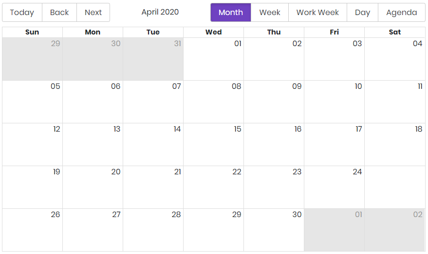
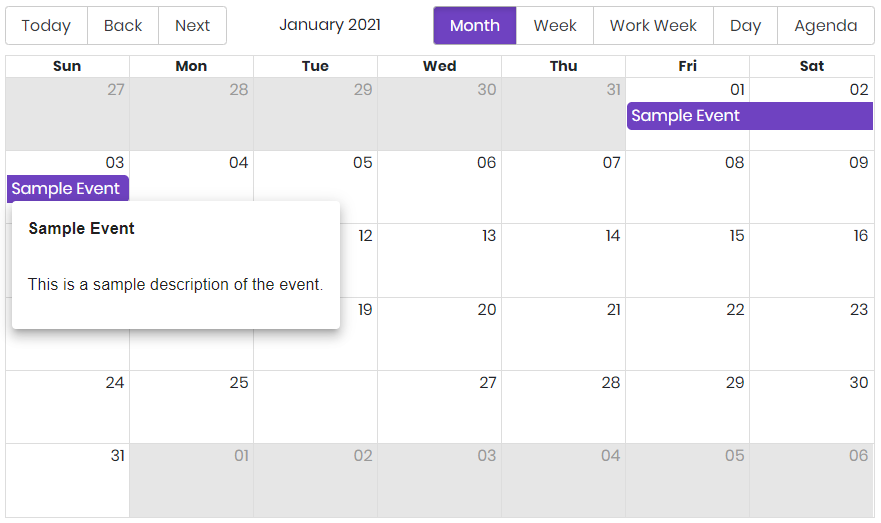

Authoring
Configure Dialog
The configure dialog allows the content author to define the calendar events and how they will be displayed to a visitor of the page.

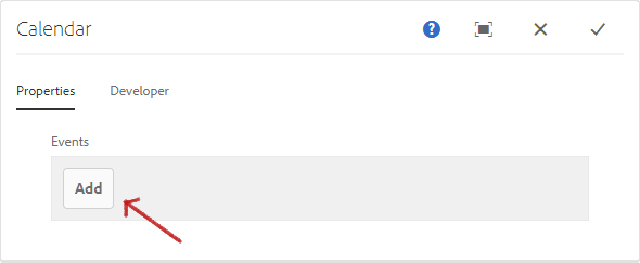
On the properties tab you can add one or more events to your calendar.
Properties Tab
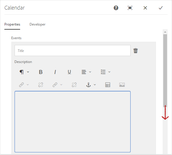
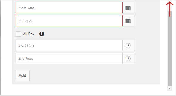
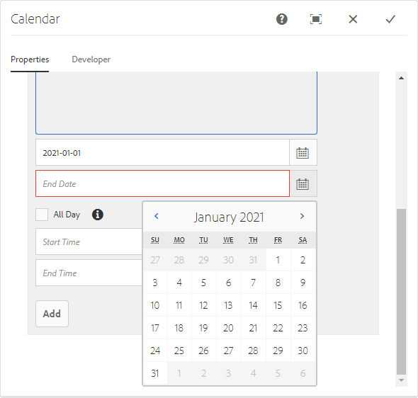
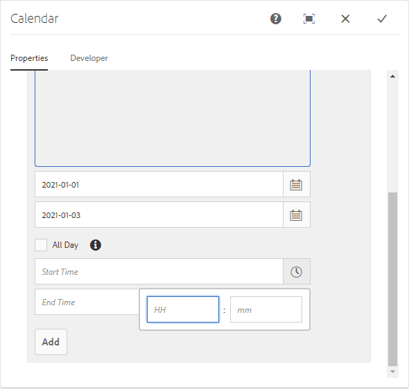
Use the Add button to add additional events. Once added, an entry is added to the list, which contains the following fields:
| Field | Description |
|---|---|
| Title | The title of the event. |
| Description | The description to be displayed with an event. The description will show on click or hover. |
| Start Date | The Starting Date of the event. |
| End Date | The Ending Date of the event. |
| All Day | If all day is selected the start and end times are not necessary and the event will apply for the entire day. |
| Start Time | The Starting Time *. |
| End Time | The Ending Time *. |
* Note
Start Time and End Time fields uses 24 hour format.
Developers
Markup
<div class="cmp-calendar"
     data-cmp-is="calendar">
    <div class="cmp-calendar__content" id="component_id" data-events="{JSON}">
      <div class="cmp-calendar__calendar">
                [REACT GENERATED]
      </div>
    </div>
</div>