Countdown
Usage
The Countdown component allows for the configuration and display of a countdown item on a page.
Examples
From top to bottom: Default, Variant 1, Variant 2, Variant 3. It can have a different look provided that the mockup design is within the component’s markup.


Authoring
Configure Dialog
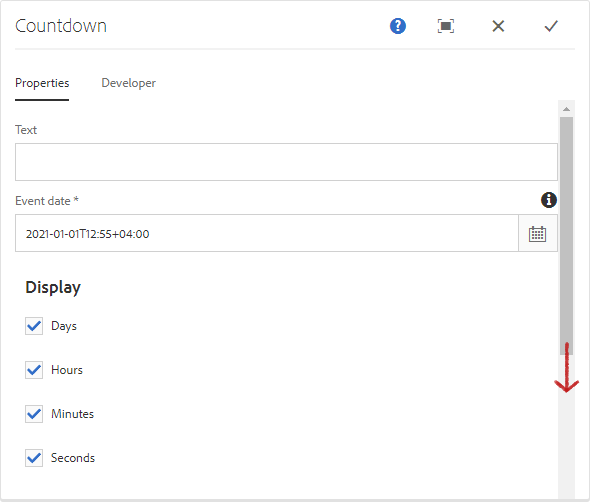
The configure dialog allows the content author to define the countdown and how it will behave and appear for a visitor to the page.

Properties Tab
| Field | Description |
|---|---|
| Text | Text that shows at the beginning of the countdown. |
| Event Date | The date and time to countdown towards. It uses the time zone provided by your browser. |
| Display | You can choose to display a combination of either Days, Hours, Minutes, or Seconds. |
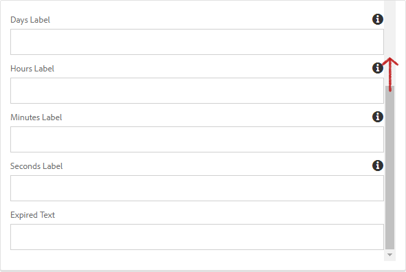
| Days Label | The custom label for displaying Days. |
| Hours Label | The custom label for displaying Hours. |
| Minutes Label | The custom label for displaying Minutes. |
| Seconds Label | The custom label for displaying Seconds. |
| Expired Text | Text to be displayed when the countdown has expired. |
NOTE
The Event Date uses the time zone provided by your browser.


Styles
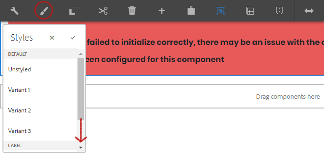
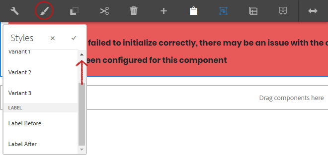
The countdown comes with a number of available styles that will be customized for your specific site and theme. You can use the styles selector to pick a style for your component.


Available Styles
- Unstyled
- Variant 1
- Variant 2
- Variant 3
Label Styles
- Label Before
- Label After
Developers
Markup
<div class="cmp-countdown"
    id="event_countdown_identifier"
    data-cmp-is="countdown">
    <span class="cmp-countdown__label">Countdown</span>
    <div class="cmp-countdown__countdown"
        data-eventdate="Fri Jan 1 2021 12:55:0 +0400"
        data-expirytext="00d 00h 00m 00s"
        data-show-days=""
        data-show-hours=""
        data-show-minutes=""
        data-show-seconds=""
        data-labels-days="Days"
        data-labels-hours="Hours"
        data-labels-minutes="Minutes"
        data-labels-seconds="Seconds">
        [GENERATED CODE]
    </div>
</div>