Teaser
The Teaser component allows for the configuration and display of a teaser item on a page.
The teaser component is highly configurable, and allows for multiple customized displays for your site.
The teaser component is the general replacement for all CTA controls.
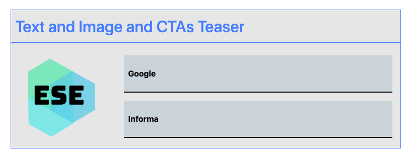
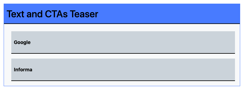
Examples
Authoring
Configure Dialog
The configure dialog allows the content author to define the teaser and how it will behave and appear for a visitor to the page.
Image Tab
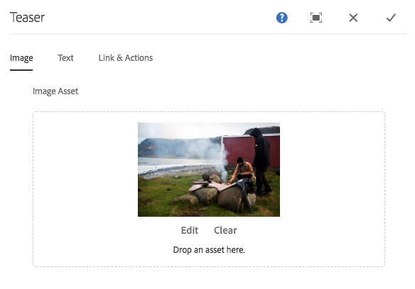
- Image asset
- Drop an asset from the asset browser or tap the browse option to upload from a local file system.
- Tap or click Clear to de-select the currently selected image.
- Tap or click Edit to mange the renditions of the asset in the asset editor.
SVG and GIF Support
The Teaser component also supports Scalable Vector Graphics (SVG) and Graphics Interchange Format (GIF)
Text Tab
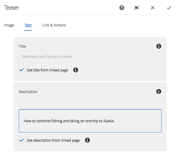
- Title Defines a title to display as the headline for the teaser.
- Get title from linked page When checked, the title will be populated with the linked page’s title.
- Description Defines a description to display as the subheading of the teaser.
- Get description from linked page When checked, the description will be populated with the linked page’s description.
Link & Actions Tab
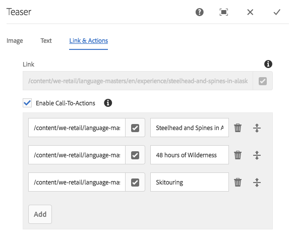
- Link Link applied to the teaser. Use the path browser to select the link target.
- Enable Call-To-Actions When checked, enables definition of Call-To-Actions. The first Call-To-Action link in the list is used as the link for other teaser elements.
Variants
The teaser can be configured to display a number of variants, use the variant wheel to pick your column configuration
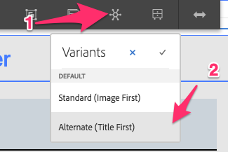
Available Variants
- Standard (Image First)
- Alternate (Title First)
Styles
The teaser comes with a number of available styles that will be customized for your specific site and theme. You can use the styles selector to pick a style for your teaser.
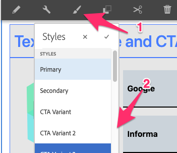
Available Styles
- Primary
- Secondary
- CTA Variant
- CTA Variant 2
- CTA Variant 3
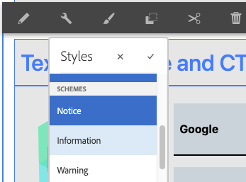
Available Schemes
- Notice
- Information
- Warning
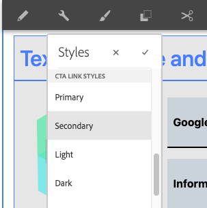
Available Link Styles
- Primary
- Secondary
- Light
- Dark
- CTA Variant
- CTA Variant 2
Developers
Markup
<div class="cmp-teaser">
  <div class="cmp-teaser__image">
    <div data-cmp-src="snowy-mountain-glacier.jpeg" data-asset="/snowy-mountain-glacier.jpg" data-asset-id="45c6ee92-90e1-4af2-af69-b6dcbc7daeb7" data-title="Snowy mountain glacier" class="cmp-image" itemscope="" itemtype="http://schema.org/ImageObject">
      <img src="snowy-mountain-glacier.jpeg" class="cmp-image__image" itemprop="contentUrl" data-cmp-hook-image="image" alt="Snowy mountain glacier" title="Snowy mountain glacier">
      <meta itemprop="caption" content="Snowy mountain glacier">
    </div>
  </div>
  <div class="cmp-teaser__content">
    <h2 class="cmp-teaser__title">
      <a class="cmp-teaser__title-link" href="teaser.html">Teaser Title</a>
    </h2>
    <div class="cmp-teaser__description">
      <p>Teaser Description</p>
    </div>
    <div class="cmp-teaser__action-container">
      <a class="cmp-teaser__action-link" href="teaser.html">Call To Action</a>
      <a class="cmp-teaser__action-link" href="../core-components-examples.html">Call To Action</a>
    </div>
  </div>
</div>