Tooltip
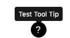
The Tooltip component allows for the configuration and display of a tooltip item on a page.
The tooltip will display a specific message on hover.
Examples
Authoring
Configure Dialog
The configure dialog allows the content author to define the tooltip and how it will behave and appear for a visitor to the page.
Properties Tab
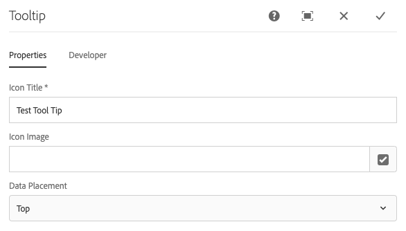
- Icon Title - The text to display on the tooltip.
- Icon Image - An optional image to utilize for the tooltip.
- Data Placement - Defines whether the tooltip shows on the top, side, or bottom.
Developers
Markup
<div class="tooltipmarker">
    <span class="cmp-tooltip custom-tool-tip">
        <a href="javascript:void(0)" class="cmp-tooltip__link cmp-tooltip__link--visble cmp-tooltip__link--mobile tooltip-mobile hidden-xs" data-toggle="tooltip" role="tooltip" data-placement="top" title="" data-original-title="Test Tool Tip">
            <img class="cmp-tooltip__img tool-tip-img" src="/etc/designs/informa/globalstyle/clientlibs/images/Question-mark.png" width="32px" height="32px" alt="Test Tool Tip">
        </a>
        <a href="javascript:void(0)" class="cmp-tooltip__link cmp-tooltip__link--visble cmp-tooltip__link--mobile tooltip-mobile visible-xs" data-toggle="tooltip" role="tooltip" data-placement="bottom" title="" data-original-title="Test Tool Tip">
            <img class="cmp-tooltip__img tool-tip-img" src="/etc/designs/informa/globalstyle/clientlibs/images/Question-mark.png" width="32px" height="32px" alt="Test Tool Tip">
        </a>
    </span>
</div>